Table of Contents
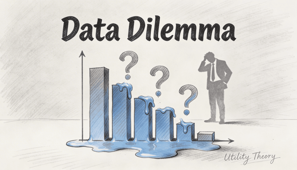
You’re drowning in data. Your dashboard glows with metrics that supposedly tell you everything about your business. Conversion rates, click-throughs, engagement scores, revenue per user. You’ve got numbers coming out of your ears.
And yet, you’re making terrible decisions.
The problem isn’t your analytics. The problem is that you’re measuring the wrong thing entirely. You’re counting what happened without understanding why it matters. You’re tracking behavior without grasping value. And this gap between measurement and meaning is costing you more than you realize.
Welcome to the world where utility theory meets analytics. It’s not a comfortable place.
The Map is Not the Territory
Analytics tells you that 10,000 people visited your site last month. Utility theory asks: so what?
This sounds dismissive, but it’s actually the most important question you can ask. Because those 10,000 visits mean radically different things depending on what those people valued, what they expected, and what they got instead.
Think about it like this. You could measure that a restaurant served 200 meals on Saturday night. Impressive metric. But if 150 of those diners were hoping for a quiet romantic dinner and instead got seated next to a screaming birthday party, your analytics and your business reality are telling completely different stories. The numbers say success. The utility delivered says disaster.
Utility theory, at its core, is about understanding value from the perspective of the person receiving it. Not from your perspective as the measurer. Not from some abstract ideal. From the actual human on the other end of your product or service.
And here’s where most analytics falls apart. You’re measuring your intentions, not their outcomes.
The Thing About Expected Value
Every person who interacts with your business has an expected utility in their head. They might not articulate it. They probably don’t even consciously think about it. But it’s there, humming away in their decision making process.
When someone clicks on your ad, they’re not just clicking. They’re making a tiny bet that the value they’ll receive exceeds the cost of their attention. When they abandon your checkout page, they’re not just leaving. They’re signaling that the expected utility dropped below their threshold.
Your analytics captures the click and the abandonment. But it doesn’t capture the collapse in expected value that caused the abandonment. So you optimize for the wrong thing. You make the checkout button bigger. You add trust badges. You reduce form fields. All reasonable interventions, except you’re operating blind to the actual problem.
Maybe your shipping costs appeared too late. Maybe your product photos set expectations your product can’t meet. Maybe your brand voice in the ads promised something your landing page didn’t deliver. These are utility gaps, not user experience problems in the traditional sense.
The person who left wasn’t confused. They understood perfectly. They just understood that you weren’t offering what they valued.
Why Marginal Utility Makes Your A/B Tests Lie
You run an A/B test. Version B wins with a 15% lift in conversions. You roll it out to everyone. Victory is declared. Bonuses are distributed.
Three months later, revenue is flat.
What happened? Marginal utility happened.
Here’s the thing about marginal utility that makes it so dangerous for analytics. The value of something changes depending on how much of it you already have. The first slice of pizza when you’re hungry is magnificent. The eighth slice makes you question your life choices.
Your A/B test captured the marginal utility for new users at that moment in time, under those specific conditions. But utility isn’t static. When you roll out the winning variant to everyone, you’re assuming the same utility calculation applies to all users in all contexts. It doesn’t.
Maybe Version B worked because it was more aggressive in its call to action. Great for people ready to buy. Terrible for people still researching. Your test captured the ready-to-buy segment. Your rollout annoyed everyone else, and they quietly stopped coming back. Your analytics shows the conversion lift. It doesn’t show the erosion in future expected utility from your increasingly alienated audience.
This is why companies often win the battle and lose the war. They optimize for the transaction without considering the relationship. They maximize immediate measured value without accounting for how each interaction shifts future utility calculations.
The Risk-Utility Tradeoff Nobody Talks About
People aren’t just maximizing value. They’re managing risk.
Your analytics might show that your premium product has a lower conversion rate than your basic product. Obvious conclusion: lower the price or simplify the offering. Except utility theory suggests something else entirely.
High-value purchases come with higher perceived risk. The utility isn’t just in what the product does. It’s in the confidence that the product will do it without causing regret, embarrassment, or wasted resources. This risk-adjusted utility is invisible to your conversion metrics.
So you look at your numbers and think people don’t value the premium features. In reality, people value the premium features but don’t trust that they’ll receive the promised utility. These are completely different problems requiring completely different solutions.
One requires changing the product. The other requires changing the signals that reduce perceived risk. Social proof, guarantees, detailed specifications, expert endorsements. None of which show up in your feature usage metrics.
The irony is that companies often cut the very elements that communicate utility reliability in the name of cleaner metrics. They remove detailed product information because it increases bounce rate. They simplify the messaging because it tests better in five-second comprehension studies. They’re optimizing for analytical clarity while destroying utility clarity.
When More Engagement Means Less Value
Every engagement metric assumes engagement is good. More time on site, more pages viewed, more features used. These all point upward in your dashboard, so they must be positive, right?
Not according to utility theory.
Sometimes engagement means confusion. Sometimes it means the person can’t find what they need. Sometimes it means your product is so complicated that accomplishing a simple task requires navigating seven different screens.
Think about search engines. The ideal utility outcome is that someone finds exactly what they need immediately and leaves. Low engagement. High utility. Your analytics would call this a failure. The user would call it success.
This disconnect between measured engagement and delivered utility creates perverse incentives. You start designing for metrics rather than value. You add features that increase session duration but decrease usefulness. You create complexity that looks like engagement but feels like friction.
The best products often have declining usage metrics over time as users learn to accomplish their goals more efficiently. Your analytics interprets this as churn risk. Utility theory interprets it as mastery. Same data, opposite conclusions.
The Hidden Cost of Optimization
Here’s where it gets uncomfortable. Every time you optimize for a metric, you’re making an implicit claim about what constitutes utility. And you’re often wrong.
You optimize for conversion rate. But high conversion might mean you’re attracting people who misunderstand what you offer. They convert, receive low utility, and never return. Your lifetime value collapses, but your conversion rate dashboard stays green.
You optimize for engagement. But high engagement might mean people are stuck in loops that don’t serve their goals. They’re engaged the way someone trapped in a maze is engaged. Active, yes. Happy, no.
You optimize for revenue. But maximum revenue extraction might mean capturing all available consumer surplus, leaving users feeling gouged. They got what they paid for in a transactional sense. They received negative emotional utility in an experiential sense.
The fundamental problem is that utility is multidimensional and often contradictory, while metrics are unidimensional and always coherent. This mismatch means optimization necessarily destroys nuance. You’re not finding the best solution. You’re finding the highest number in a system that reduces complex human value judgments to trackable proxies.
What Utility Theory Actually Demands
If you take utility theory seriously, it changes everything about how you approach analytics.
First, you have to accept that the moment of transaction isn’t the moment of utility. Someone buying your product is an input, not an outcome. The outcome is whether the product delivered the expected value. Your analytics obsesses over inputs because they’re measurable. Utility theory demands you find ways to measure outcomes, even when they’re harder to track.
Second, you have to acknowledge that different users have different utility functions. The same feature delivers different value to different people. Personalization isn’t about showing different content. It’s about recognizing different value calculations and serving them appropriately. Your aggregate metrics hide this heterogeneity, giving you an average that represents nobody’s actual experience.
Third, you have to admit that utility changes over time and context. Someone’s needs shift. Markets evolve. Competitors alter expectations. Your historical analytics tells you what worked before. Utility theory reminds you that before isn’t now, and what delivered value then might not deliver value today.
This makes analytics harder, not easier. Utility-aware analytics requires talking to users, understanding contexts, tracking long-term outcomes, and accepting ambiguity. It means supplementing your quantitative dashboards with qualitative insight. It means being humble about what your numbers actually show.
The Lens That Changes Everything
Here’s what happens when you start viewing your analytics through a utility theory lens. You stop asking “what did users do?” and start asking “what value did users seek, and did they receive it?”
Your bounce rate stops being a pure negative. Now it’s a signal to investigate. Did people bounce because they immediately found what they needed? Or because they immediately knew you couldn’t provide it? Same metric, entirely different implications.
Your retention curve stops being a simple health indicator. Now it’s a story about evolving utility. Who stays and why? Who leaves and when? What does that pattern reveal about how value accrues or erodes over the user lifecycle?
Your conversion funnel stops being a leaky pipe to fix. Now it’s a series of utility calculations where users progressively decide whether the expected value exceeds the required investment. Each drop-off point represents a utility threshold you failed to clear.
This shift from behavioral analytics to utility analytics doesn’t require throwing out your existing tools. It requires reinterpreting what they mean. The numbers don’t change. Your understanding of what they represent changes completely.
Why This Matters More Now
We’re entering an era where behavioral data is abundant but utility insight is scarce. Everyone has analytics. Everyone tracks metrics. Everyone optimizes conversion funnels.
The competitive advantage isn’t in better measurement. It’s in better interpretation. It’s in understanding why the numbers are what they are, not just what they are.
Companies that grasp utility theory will make better strategic decisions even with the same data as their competitors. They’ll know which metrics actually correlate with delivered value. They’ll recognize when optimization is value-destructive. They’ll design experiments that test utility hypotheses rather than just interface variations.
This isn’t about getting more sophisticated analytics tools. It’s about developing more sophisticated thinking about what value means and how to recognize it in your data.
Your analytics will tell you that a new feature increased usage by 23%. Utility theory will help you understand whether those users are getting more value or just spending more time accomplishing the same thing less efficiently.
Your analytics will show revenue growth. Utility theory will help you discern whether you’re genuinely creating more value or just extracting more money from the same value pool.
Your analytics will highlight which segments convert best. Utility theory will reveal which segments receive the most lasting value, even if they take longer to convert.
The Uncomfortable Truth
Most companies are optimizing for metrics that don’t correlate with value. They’re getting better at measuring the wrong thing. Their analytics are sophisticated, comprehensive, and fundamentally misleading.
Not because the analytics are broken. But because the mental model connecting measurement to meaning is broken.
Utility theory doesn’t give you easier answers. It gives you better questions. It forces you to confront the gap between what you track and what matters. It demands intellectual honesty about whether you’re measuring value or just measuring activity.
Your analytics aren’t useless. But without utility theory, they’re like a speedometer that tells you how fast you’re going without indicating whether you’re headed in the right direction. Precise, accurate, and potentially catastrophic if you don’t realize what’s missing.
The data won’t save you. Understanding what the data means about human value might.