Table of Contents
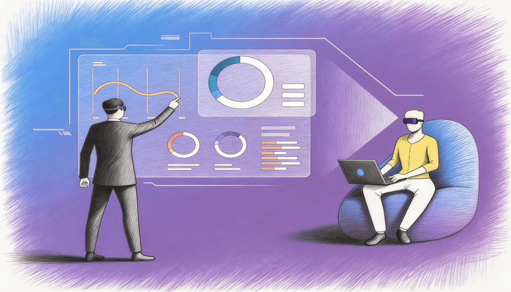
The executive stares at a dashboard. Red arrows point downward. Green bars climb upward. Numbers blink, refresh, demand attention. In that moment, something curious happens. The dashboard doesn’t just show information. It creates a psychological reality that shapes what the executive sees, what they ignore, and ultimately what they decide.
We’ve entered an era where every organization treats dashboards as neutral instruments. They’re positioned as windows into truth, as if data visualization simply reveals what already exists. But this belief misses something fundamental about how human minds work. A dashboard is less like a window and more like a lens that bends light. It doesn’t just display reality. It constructs it.
The Illusion of Objectivity
Consider how different a quarterly earnings report feels when presented as a static PDF versus an animated dashboard. The PDF sits there, inert and complete. The dashboard moves, updates, pulses with life. Both contain identical information, yet they trigger entirely different cognitive responses.
The moving dashboard creates urgency. It suggests that action must be taken now because the numbers are changing as you watch. The static report invites contemplation. It implies that reflection might be appropriate before making decisions. Neither format is objectively better, but each nudges the executive toward a different style of thinking.
This is where the psychology gets interesting. Research on decision-making reveals that humans don’t process information and then form judgments. Instead, we often form rapid intuitive judgments and then use information to justify what we already felt. The format in which information arrives shapes those initial intuitions more powerfully than most executives realize.
A dashboard dominated by red alerts triggers threat responses. The brain shifts into defensive mode, prioritizing risk mitigation over opportunity exploration. This isn’t a conscious choice. It’s an automatic reaction that happens before rational analysis begins. The same data presented in neutral colors with context might lead to entirely different strategic choices.
The Tyranny of the Measurable
Dashboards have a subtle but profound bias. They can only show what can be measured. This seems obvious, almost banal. But the implications ripple outward in ways that reshape entire organizations.
When executives rely heavily on dashboards, they gradually become blind to everything that isn’t captured in metrics. Customer relationships become numbers on a satisfaction score. Employee morale transforms into engagement percentages. Innovation gets reduced to patent counts or R&D spending ratios.
The unmeasured slowly becomes the unmanaged. And eventually, it becomes the unimportant.
Think about company culture. Every executive claims culture matters deeply. Yet culture rarely appears on dashboards because it resists quantification. You can measure proxy indicators like turnover rates or survey scores, but these capture culture the way a thermometer captures what it feels like to stand in the rain. The number tells you something, but it misses the essence.
This creates a peculiar organizational blindness. Leaders make decisions based on what their dashboards highlight while the forces that actually determine success or failure operate in the shadows, unmeasured and therefore unseen.
The Dangerous Comfort of Patterns
Human brains are pattern recognition machines. We find patterns everywhere, even in randomness. Dashboards feed this hunger by presenting data in ways that emphasize patterns, trends, and correlations.
A line graph trending upward feels meaningful. It suggests momentum, progress, a story of improvement. But sometimes that line represents nothing more than noise, random variation that will reverse next quarter for no particular reason. The dashboard doesn’t indicate which interpretation is correct. It just shows the line going up, and our brains fill in a narrative.
This is how dashboards can make executives simultaneously more informed and more deluded. They have more data than ever before, but they’re also more likely to see false patterns and mistake correlation for causation. The very tools meant to clarify reality can obscure it.
There’s a counterintuitive effect here. As dashboards become more sophisticated, adding predictive analytics and AI-driven insights, executives may actually understand their businesses less deeply. They see the output of complex algorithms but lose touch with the underlying mechanisms that drive their organizations. They know what the model predicts without understanding why.
The Social Reality of Shared Dashboards
When an entire executive team looks at the same dashboard in a meeting, something beyond individual psychology takes over. The dashboard becomes the shared reality that structures conversation.
Whoever controls what appears on that screen holds enormous power over organizational attention. If marketing metrics dominate the display, marketing concerns dominate the discussion. If the dashboard emphasizes efficiency metrics, conversations about innovation or long-term strategy struggle to find oxygen.
This dynamic mirrors how maps shaped colonial thinking. Cartographers decided what to include and what to omit, where to place borders, which regions to enlarge or shrink. Their choices reflected and reinforced power structures. Modern dashboards operate similarly, encoding assumptions about what matters while claiming to simply represent facts.
The most influential person in an organization might not be the CEO. It might be whoever designs the dashboards that executives consult before making decisions. That person determines what questions get asked and which ones never surface.
Speed Versus Wisdom
Dashboards promise real-time insights. Data updates continuously. Executives can monitor performance hourly instead of monthly. This acceleration changes the texture of decision-making.
There’s an unspoken assumption that faster information enables better decisions. But speed and wisdom don’t always align. Some of the best strategic decisions require slow thinking, the kind that happens when you step away from the screen and let your mind wander.
Real-time dashboards can trap executives in a reactive mode. They respond to each fluctuation, each new data point, constantly adjusting course. This creates the illusion of decisive leadership while potentially preventing the deeper strategic thinking that actually matters.
Think of it like checking stock prices every five minutes versus annually. The frequent checker experiences more anxiety and makes more trades. The annual checker might achieve better returns simply by avoiding noise-driven decisions. The same logic applies to business dashboards, though few executives want to admit it.
The Memory Problem
Dashboards excel at showing the present. They’re adequate at displaying trends over time. But they’re terrible at preserving context and institutional memory.
When an executive looks at a metric that has declined, the dashboard shows the number and perhaps a comparison to last quarter. What it doesn’t show is why that metric mattered in the first place, what strategic debates led to measuring it, or what circumstances have changed since it became a key performance indicator.
Organizations accumulate metrics over time. Each one made sense when someone added it. But collectively, they can create a measurement system that reflects past priorities rather than current realities. The dashboard becomes an archaeological record of old strategies, and executives waste attention on metrics that no longer matter.
This is one reason why fresh perspectives often see things that insiders miss. The newcomer asks why we measure something, and the answer is often just that we’ve always measured it. The dashboard has solidified thinking rather than enabling it.
The Aesthetic Dimension
We rarely discuss this, but it matters: dashboards are designed objects with aesthetic qualities that influence how people feel about the information they display.
A cluttered, ugly dashboard creates a sense that the organization is messy and confused. A clean, elegant dashboard suggests competence and control. These feelings affect confidence and decision-making even when the underlying data is identical.
Color choices, typography, layout, animation styles, all these design elements send psychological signals. They can make threats seem urgent or manageable, opportunities seem exciting or risky, performance seem impressive or disappointing.
The best dashboard designers understand they’re not just arranging data. They’re crafting an emotional experience that shapes how executives feel about their business. This isn’t manipulation. It’s an acknowledgment that humans are emotional beings who make decisions through a blend of analysis and intuition.
What This Means for the Future
Organizations are doubling down on dashboards. They’re investing in more data sources, more sophisticated visualizations, more AI-driven insights. This trajectory seems inevitable.
But the smartest leaders are also cultivating something else: dashboard skepticism. They’re learning to treat dashboards as useful tools rather than sources of truth. They’re asking what isn’t shown, what can’t be measured, what the design choices are emphasizing or hiding.
They’re building practices that counterbalance dashboard culture. Regular conversations without screens present. Strategic sessions where data is deliberately excluded for the first hour. Devil’s advocates assigned to challenge dashboard-driven conclusions.
This isn’t about rejecting data or returning to gut-feel decision-making. It’s about recognizing that dashboards are psychological instruments that shape thinking in specific ways. Understanding those effects allows leaders to use dashboards more intelligently while avoiding their traps.
The Paradox of Insight
The more you understand about dashboard psychology, the less you can unsee it. Every time you look at a dashboard, you notice the design choices, the framing effects, the measured and unmeasured dimensions. This awareness changes how dashboards affect you.
In that sense, knowledge about dashboard psychology functions like a kind of inoculation. It doesn’t eliminate the effects, but it weakens them. You become slightly less susceptible to the cognitive shortcuts that dashboards exploit.
The executives who will thrive in the coming decade won’t be those who have the best dashboards. They’ll be those who understand what dashboards do to human minds and who build organizational practices that compensate for dashboard-induced blind spots. They’ll create space for the qualitative insights, contextual understanding, and strategic imagination that no dashboard can capture. They’ll treat their dashboards as valuable but limited tools, not as substitutes for thinking.
The dashboard shows you numbers. But wisdom is knowing what those numbers mean, what they miss, and when to ignore them entirely. That’s the performance frontier that actually matters. Not building better dashboards, but building better thinkers who know how to use them without being used by them.